
CASE STUDY / 03
CREARUSH
Energy meets e-commerce.
A bold sports-nutrition experience that brings the product, packaging, and shopping journey together across desktop and mobile.
Sports Nutrition
Strategy · UI/UX · E-Commerce
PROJECT PRESENTATION
A high-energy identity, built for the full shopping journey.
Explore the complete project presentation below.

PROJECT OVERVIEW
Product energy with a clear path to purchase.
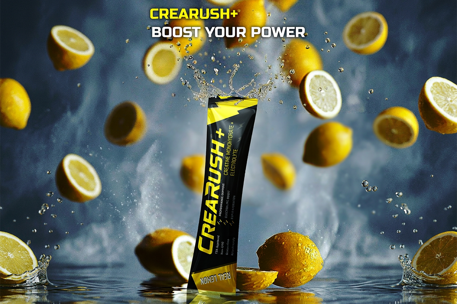
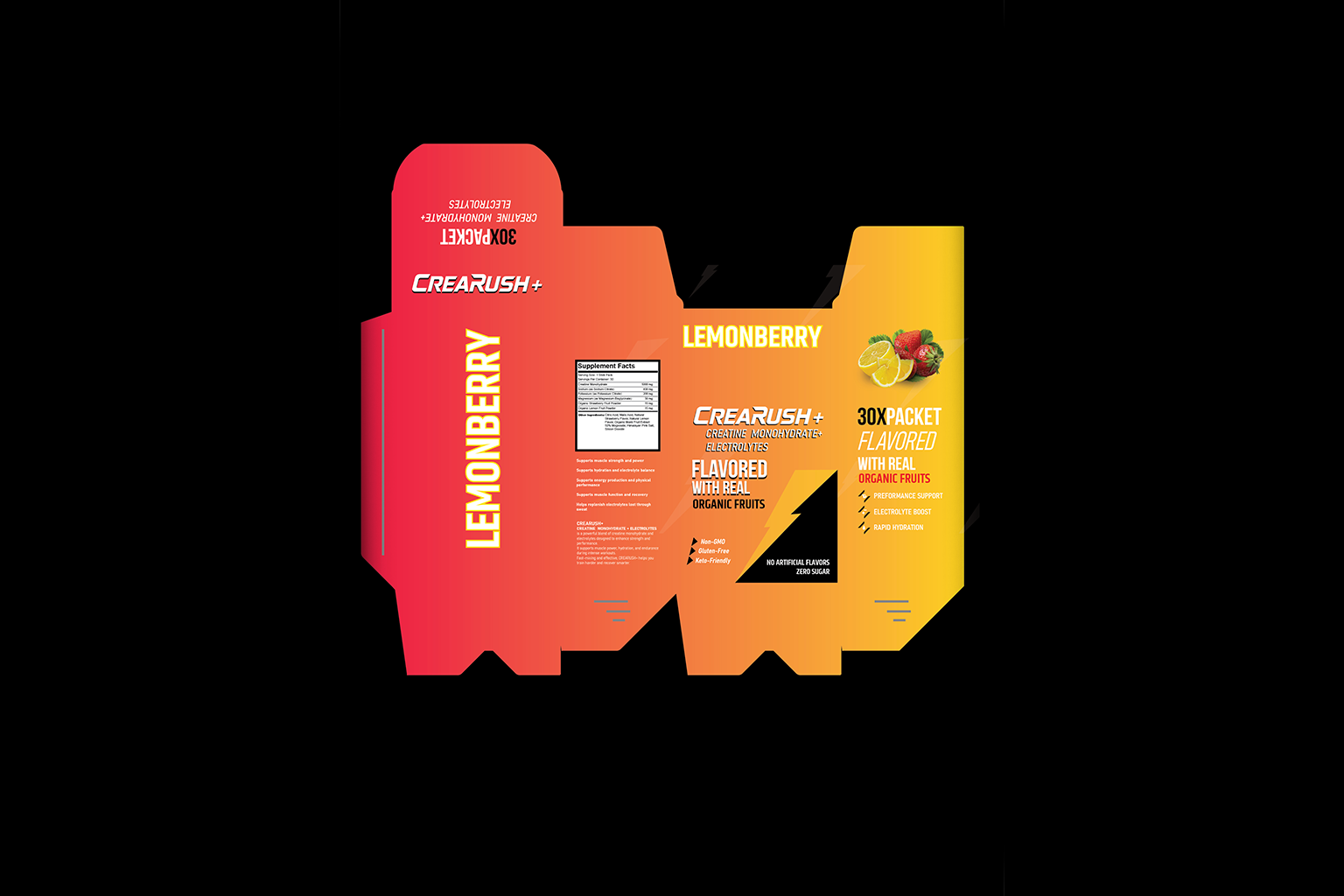
CreaRush needed an e-commerce experience that could carry its bold visual personality without getting in the way of product discovery. The design connects packaging-led imagery, useful content, and a straightforward shopping flow.
CLIENT
CREARUSH
INDUSTRY
Sports Nutrition
SERVICES
Strategy · UI/UX · E-Commerce
01 / CHALLENGE
Bold, but always shoppable.
The brand’s strong colors and energetic graphics needed room to lead while product details, benefits, cart actions, and checkout remained easy to understand.
02 / APPROACH
Let the product drive the system.
We used black-and-white foundations with focused yellow and pink accents, then built the page hierarchy around products, supporting content, and decisive calls to action.
WHAT WE DELIVERED
Built as one connected experience.
01
Brand-Led Homepage
A bold opening turns the packaging and visual language into an immediate brand experience.
02
Product Presentation
Clear layouts balance product imagery, benefits, information, and purchase actions.
03
Content With Purpose
Supporting sections add context and credibility without interrupting the shopping flow.
04
Structured Shopping
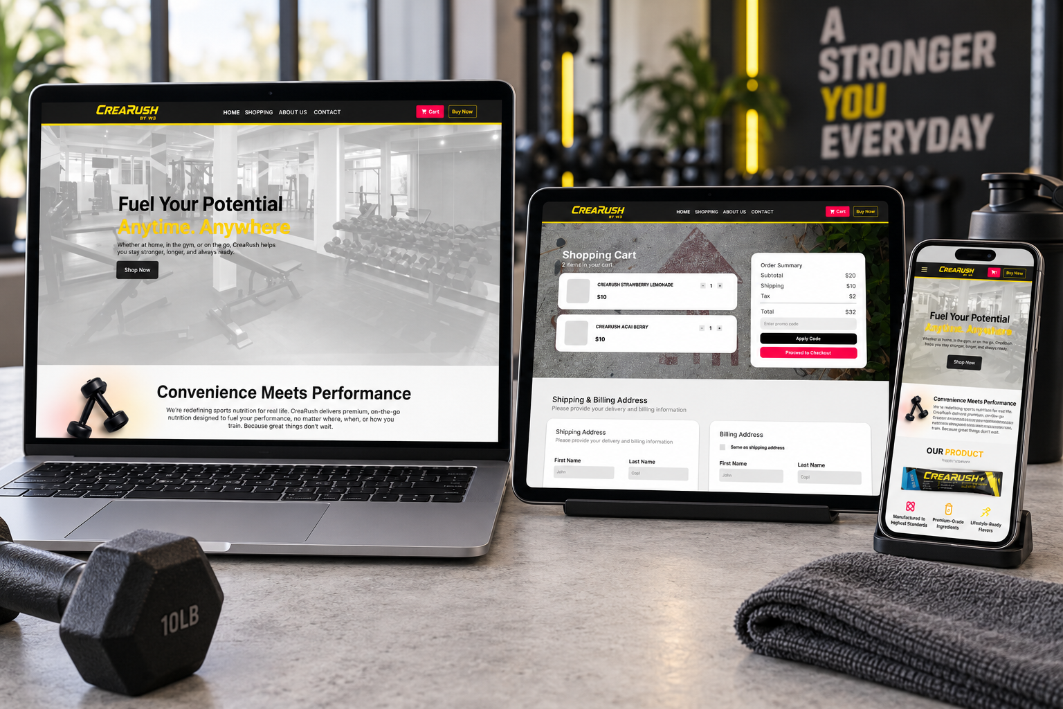
Responsive product, cart, and checkout experiences keep the route to purchase direct.
THE OUTCOME
A distinctive store that stays easy to use.
The final experience gives CreaRush a recognizable digital presence and a connected shopping journey—from first impression and product exploration through cart and checkout.
Responsive across desktop, tablet, and mobile—without losing the visual character of the brand.
START A PROJECT
Have a business worth building around?
Let’s create a digital presence that feels distinct, works clearly, and grows with your business.